Carter Bakkum, Senior Data Analyst, Healthcare Insights
Carter is a senior data analyst who works to turn complex, messy data into actionable intelligence. Carter studied economics and statistics at the University of Virginia before joining an economic consulting firm, where he supported expert testifying economic witnesses on behalf of fortune 500 healthcare companies. After the significant changes in the importance of data analytics during the pandemic, Carter joined the Trella team to dive deeper into the numbers to uncover the stories that drive our experience.![]()
Blog
Home Health Patient Mix Changes 2021
Using home health patient mix trends to identify market opportunities: 2018-2021
By Carter Bakkum | October 19, 2021
The post-acute care landscape is constantly changing and evolving. In this dynamic market, it’s essential to understand broad changes and long-term trends in home health agencies’ patient mixes across the country. When you have a clear view of the patient populations in your area, and specifically the growth and shrinkage of certain diagnostic categories, you can identify opportunities in your market to expand certain therapeutic categories and decrease investment in shrinking patient populations.
Methodology
With this in mind, the Trella team used 100% of Medicare Parts A and B data to investigate how patient populations have changed based on their diagnostic categories between 2018 and 2021. By comparing how much certain diagnostic categories increased or decreased within given reporting periods, we identified some interesting healthcare trends that could help home health agencies make better-informed decisions for 2022 and beyond.
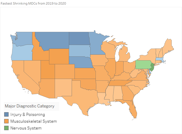
Identifying MDC shrinkage trends: 2018-2020
In our first graphic, you’ll see a map of the continental U.S., with each state’s color representing the major diagnostic category (MDC) that shrank the most, based on data beginning in the reporting period between Q2 2018 through Q1 2019, compared with data from the reporting period between Q2 2019 through Q1 2020. For our purposes, we determined shrinkage based on the percentage of total home health admissions with each MDC.
As you examine the map, you can see not only which MDC had the most shrinkage in each state, but also the level of shrinkage. The color of each state represents the MDC with the most shrinkage, while the shade represents how much the diagnostic category shrank between reporting periods. Darker shades indicate larger decreases, while lighter shades indicate less dramatic decreases. For example, South Dakota’s MDC with the greatest decrease in this time span was injury & poisoning, but the state saw a less significant decrease in this category than North Dakota.
When we look at the map as a whole, we can see that – by far – musculoskeletal system is the most commonly shrinking diagnostic category, which appears as the MDC with the greatest decrease for 39 out of 51 states (counting Washington, DC). And, while this is noteworthy, perhaps the most interesting trend is the pattern of decreasing injury & poisoning admissions, which appear consistently across northern and Midwest states (with the exception of Massachusetts).

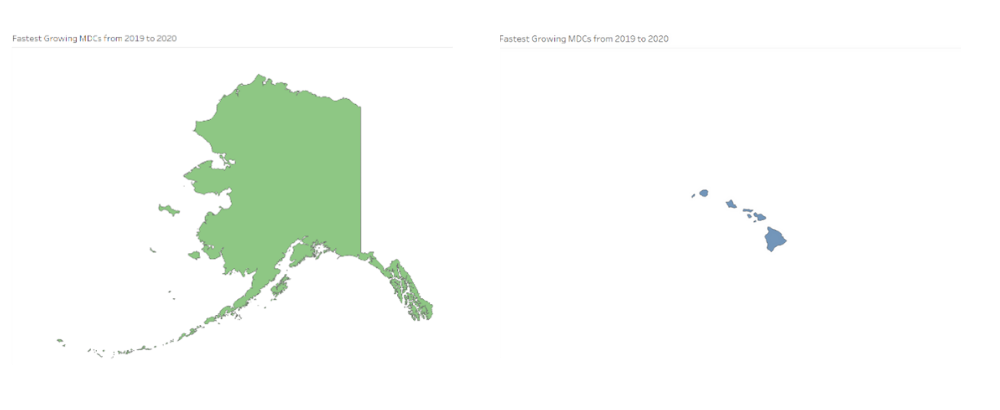
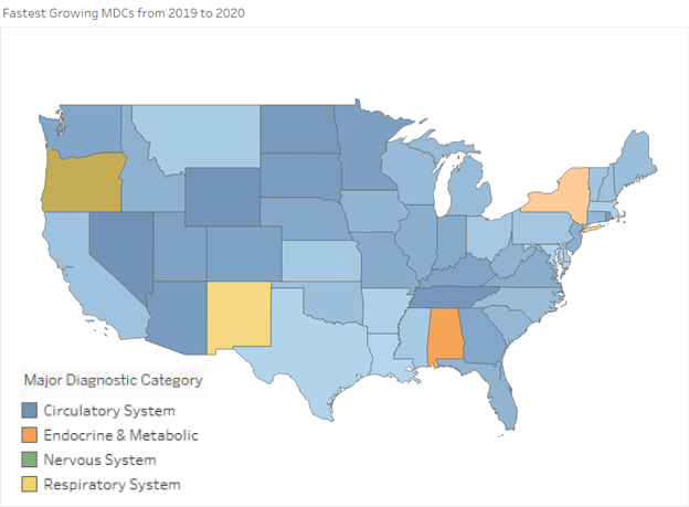
Diagnostic category growth: 2018-2020
Now that we’ve explored trends in shrinking diagnostic categories, let’s take a look at the patient populations that were growing across the country for these reporting periods. The below map illustrates the fastest-growing MDCs by state. Again, the depth of color indicates the rate of increase, with darker colors indicating larger increases than lighter colors.
With just a few outliers, we see a nearly-universal trend toward more circulatory system patients, with 46 out of 51 states showing circulatory system patients as their fastest-growing MDC. This trend shouldn’t be a major surprise, as it’s well known that congestive heart failure is one of the country’s leading causes of death. This does, however, provide confirmation that home health agencies specializing in circulatory system care are well poised to handle the continued rise in Medicare patients with circulatory diagnoses. If this is an area where your agency excels, understanding this trend could help set you apart from competing agencies.
Ongoing MDC growth and shrinkage trends: 2019-2021
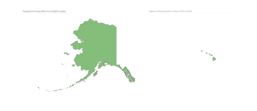
Moving forward in time, let’s examine the greatest patient mix changes between the 2019 Q2 through 2020 Q1 and 2020 Q2 through 2021 Q1 reporting periods. We can then compare these trends against one another to get a better view of long-term changes and what they may mean for your market. The below map shows, again, state-by-state trends for the greatest shrinkage per MDC. Here, we can see that musculoskeletal system home health patients saw decreases in many states, though respiratory patients also saw significant decreases in a large number of states.
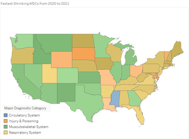
As we consider potential causes for changing trends in decreasing MDCs, we cannot ignore the COVID-19 public health emergency. One possible explanation for the shrinkage we see in respiratory illness as the primary diagnosis for home health agencies could be the increase in the diagnosis of COVID-19 during the 2021 Q1 reporting period.
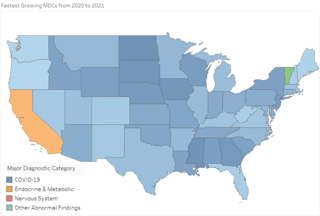
With this in mind, it’s not surprising to see – in the map below – that COVID-19 is the largest increase for the 2020 Q1 and 2021 Q1 reporting periods. As COVID-19 ravaged the country, many patients both after an acute stay and without an inpatient claim turned to home health agencies to recover from the illness. Thus, it’s likely that many of the patients that fell within the respiratory or cardiac MDCs were admitted with a COVID-19 MDC.
Next steps: How well do you know your patient populations?
By investigating the growth and shrinkage of diagnostic categories in two reporting periods across the country, we can make several assumptions about the home health industry and the patient populations in most need of attention. We know that circulatory system diagnoses are on the rise nationwide, while northern and midwestern states have seen a decrease in injury & poisoning. Thus, it makes sense to focus more on circulatory therapies than increasing therapies specific to injuries & poisoning. At the same time, if we looked only at the decrease in respiratory diagnoses without considering the prevalence of COVID-19 cases since 2020, we might mistakenly deemphasize respiratory treatments.
Having a clear view of your current patient mix and changes over the last few years can help your agency create a data-informed strategy for the coming year. To see how access to the right data can help you better partner with referral sources and better serve your most vulnerable patient populations, check out Marketscape Strategy by Trella today.
Trella Health is the leader in market intelligence for the 65+ population, with extensive data sets including Medicare FFS, Medicare Advantage, commercial payers, ACOs, and DCEs. For more insights into how to stand out as a preferred referral partner, schedule a demo today.
About the Author:
