Network Insights for Hospitals and Health Systems

Fewer readmissions. Stronger partners. Lower episode costs.

Most health systems lack a unified view of where patients go after discharge. Network Insights connects your hospital NPIs to actual patient flow, quality scores, and peer benchmarks in one place.

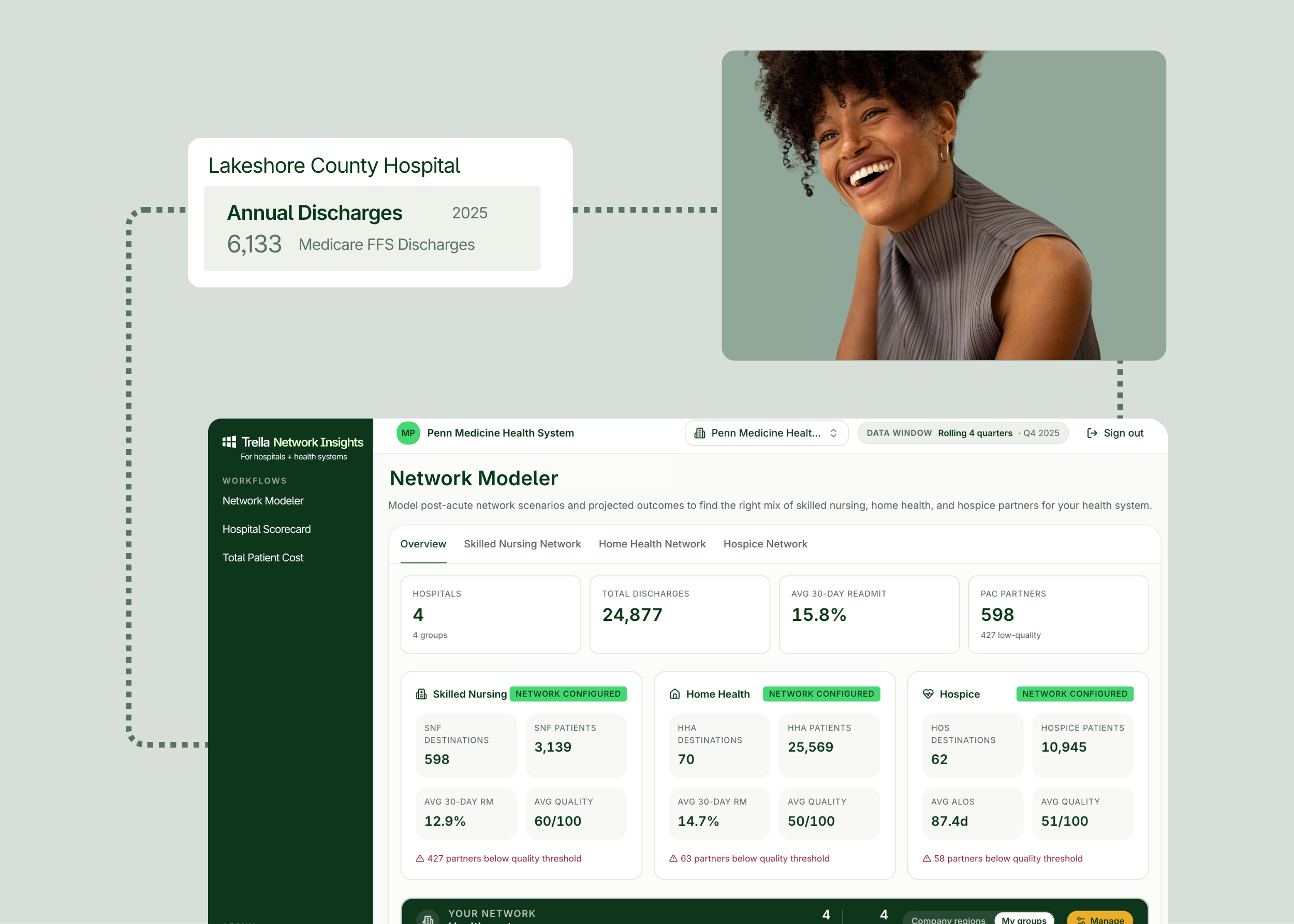
Screenshot of a healthcare dashboard showing hospital discharge data, network statistics, and a smiling woman in a separate image above the dashboard.

Everything your team needs to see, score, and reshape your post-acute network.

Network Modeler

Build and score your network across SNF, home health, and hospice. Simulate affiliation changes before you commit.
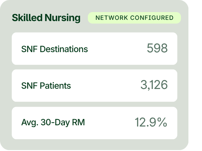
A dashboard displays 598 SNF destinations, 3,126 SNF patients, and an average 30-day RM rate of 12.9% for skilled nursing, with network configured status shown.
Hospital Scorecard

Benchmark any hospital’s PAC performance, including readmissions, LOS, and diagnostic groups, against state and county peers.
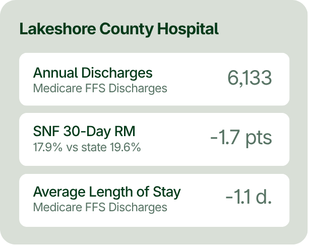
Medical data summary showing 6,133 annual discharges, SNF 30-day RM at -1.7 points, and average length of stay at -1.1 days for Lakeshore County Hospital.
Total Patient Cost

Compare episode-level spend across facilities for the full continuum: inpatient, SNF, HHA, hospice, and DME.
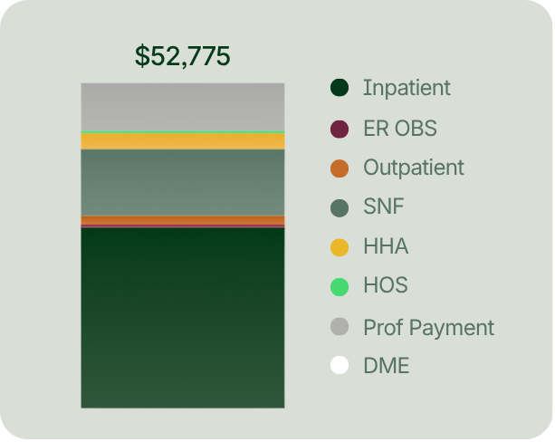
Bar chart with segments in various colors representing healthcare costs totaling $52,775, categorized by service types like inpatient, outpatient, ER, SNF, HHA, HOS, professional payment, and DME.

Network Modeler

Test the network change before you make it

Upload your hospital NPIs and Trella Network Insights builds your combined post-acute network, volume-weighted across skilled nursing, home health, and hospice.

Shift volume to any partner and the projected impact updates live: length of stay, hospitalization rate, 30-day readmission, and network quality, shown as current versus preferred versus your model. As you build a scenario, the platform tracks every change, benchmarks it, and flags the differences.
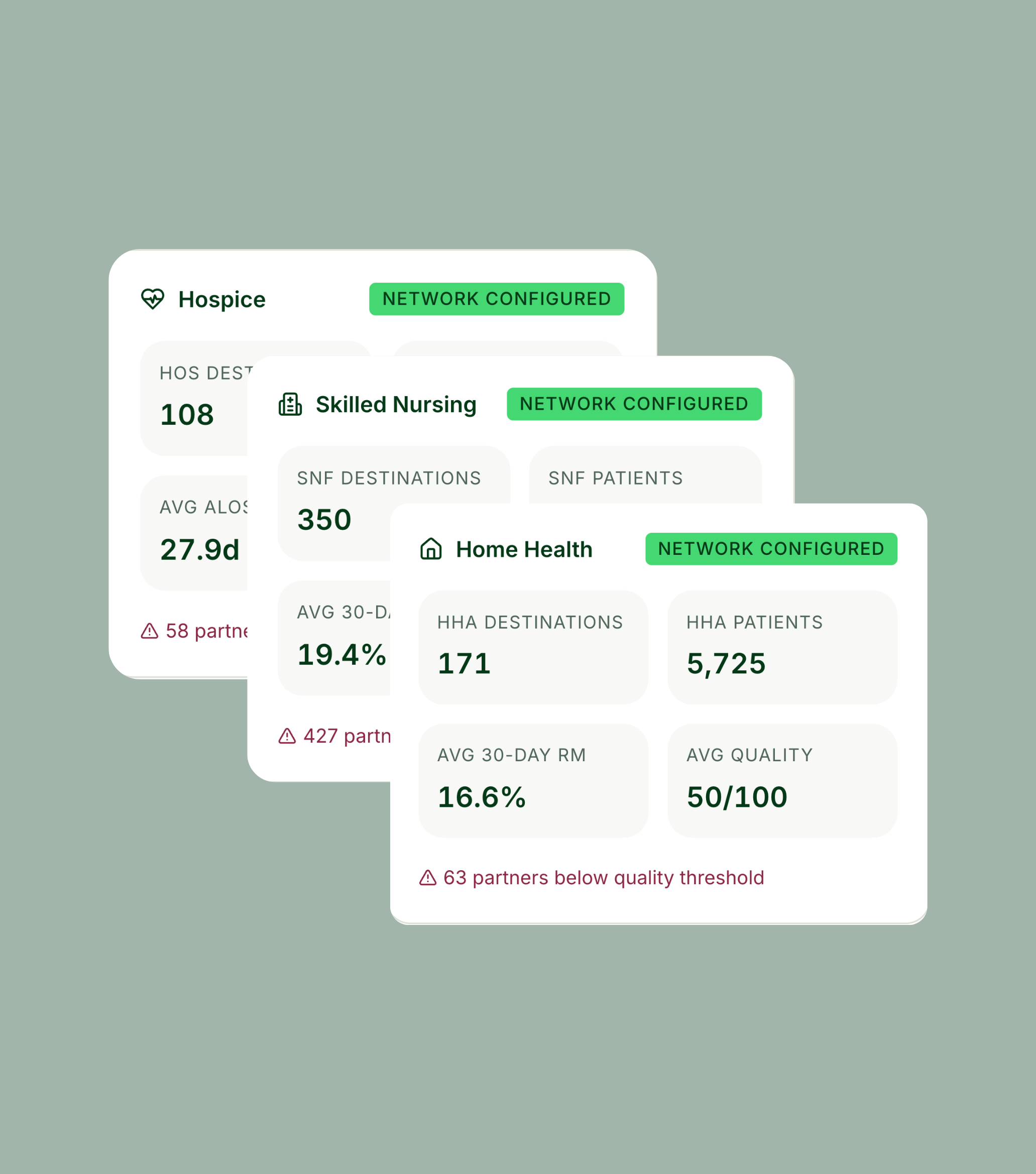

Access skilled nursing, home health, and hospice lines of business, with the same evaluation tools.

Three healthcare network cards display statistics for Hospice, Skilled Nursing, and Home Health, each marked “Network Configured” with partner counts and alerts for below-threshold partners.

You control how the Trella Score is weighted. Rebalance facility-specific hospitalization rates, risk scores, 30-day readmissions, and inpatient ALOS — or add your own engagement metric — and the score recalculates instantly.

A man in blue scrubs stands by a window; next to him is a table titled “Telia Score breakdown” with various healthcare metrics and a total score of 68/100.

Model the system-wide network or drill into a single facility or regional group.

A person sits at a table working on a laptop with a mug nearby. On-screen, a filter menu shows “Whole system,” “Groups,” and “Individual hospital” options.

Filter partners by preferred and/or out-of-network to build multiple models, compare them, and bring the one that works to your network committee.

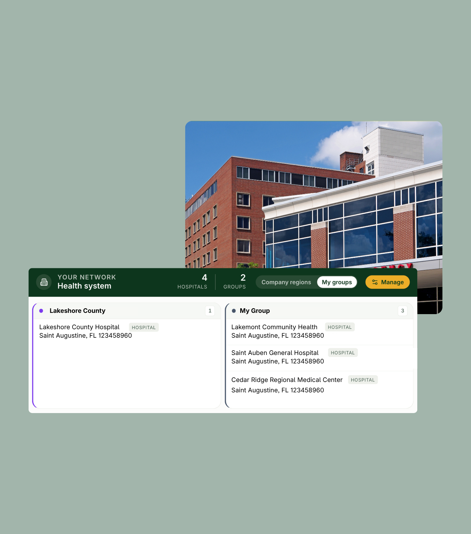
A hospital building is shown above two digital interface cards listing hospital groups and their details, including names and addresses.

Hospital Scorecard

Know exactly how each hospital is performing

Start with a per-hospital read on post-acute performance for every hospital nationwide, benchmarked against county and state peers. Every scorecard opens with an AI Trella Takeaway, a short executive summary that flags the priority signals and names a recommended action, so it starts at “what do we do” instead of “what does this mean.”
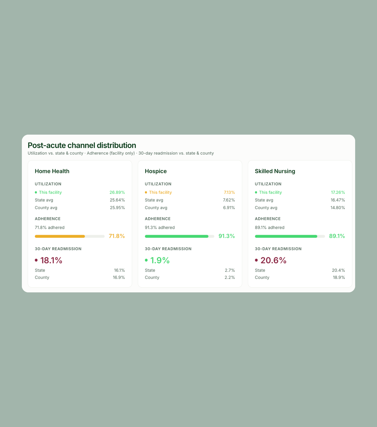
Leverage utilization, adherence, and 30-day readmission data for home health, hospice, skilled nursing, acute rehab, and long-term acute care, each against county and state averages.

Table showing post-acute channel distribution data for Home Health, Hospice, and Skilled Nursing, including utilization, adherence, and 30-day readmission rates by facility, state, and county.

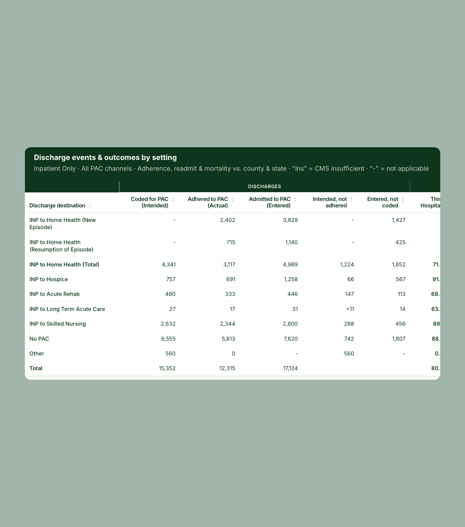
See how many patients were coded for post-acute care versus how many actually got there. Intended-not-adhered and entered-not-coded columns expose the gap between the discharge plan and what happened, alongside adherence, readmission, and mortality rates by destination.

Table showing discharge destinations and outcomes for inpatient events, comparing actual, intended, and entered-to hospitalizations across different post-acute care settings.

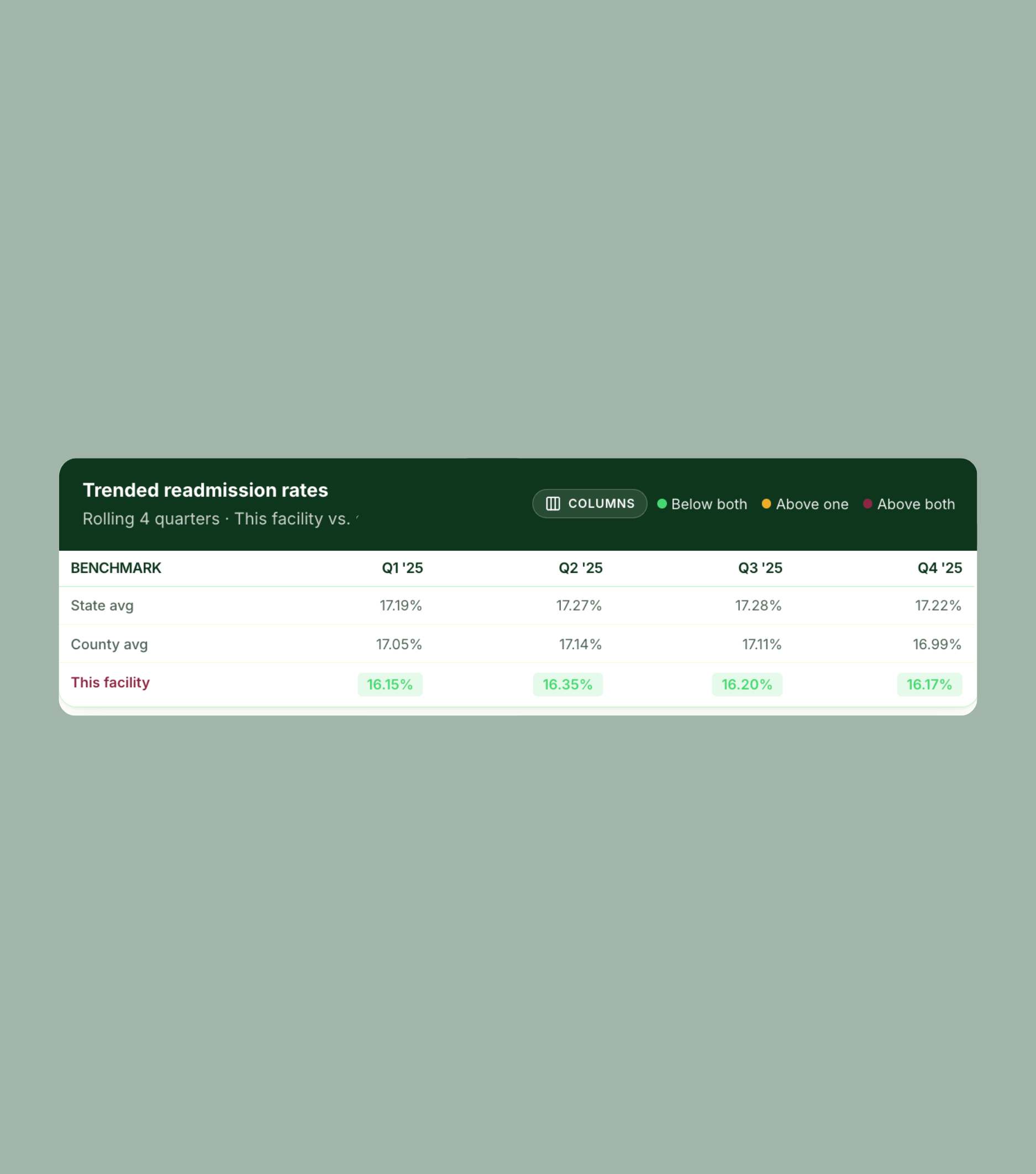
Access rates across rolling four quarters for both state and county, with above/below benchmarks flagged at a glance.

Table showing trended readmission rates for 2025 by quarter, comparing state, county, and facility; facility rates are highlighted in green and lower than state and county averages.

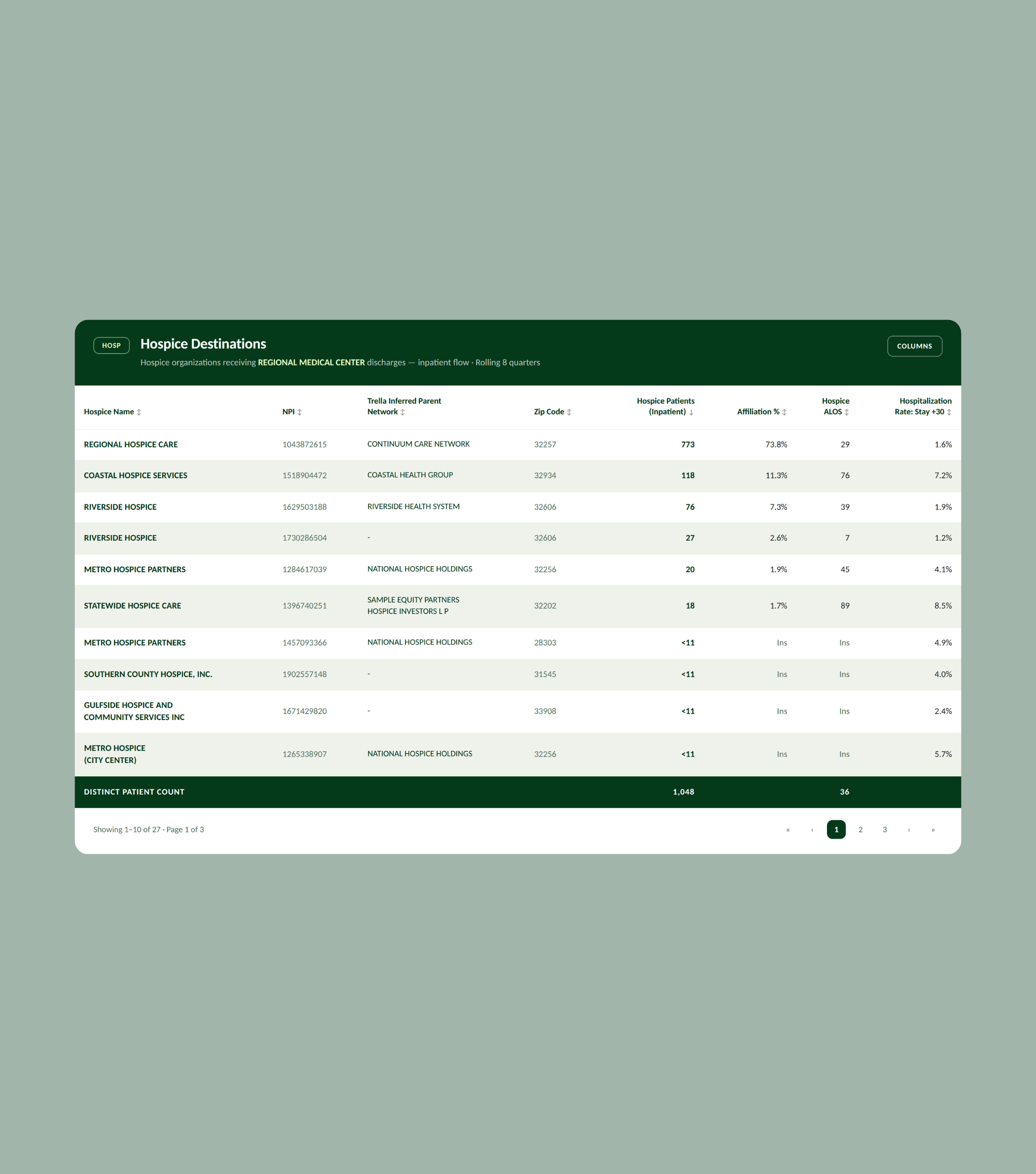
See every facility receiving your discharges, with inferred parent network, volume, affiliation share, inpatient ALOS, average Medicare days per stay, facility-specific rehospitalization rate, patient risk category, and 30- and 60-day readmission.

A table displays hospice destinations with columns for name, total patients, zip code, facility, patients, affiliation percentage, transfer percentage, and share.

Drill down from service line to DRG, then compare annual Medicare FFS patients by quarter, length of stay, readmission, 30-day mortality, and skilled nursing utilization versus benchmarks. Understand the impact on post-acute destinations’ quality for those patient cohorts on overall hospital performance.

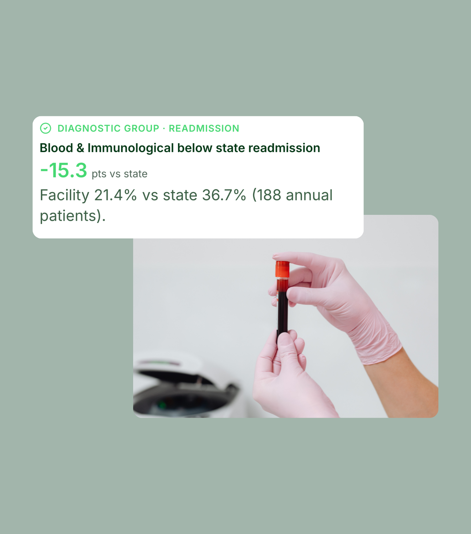
Gloved hands hold a blood sample tube; overlay shows facility’s readmission rate is 21.4% vs state’s 36.7% (188 patients), a -15.3 point difference.

CMS TEAM

Episode accountability you can actually manage

See your TEAM discharge volume and what share of total volume it represents. View your average readmission rate, and a category-by-category breakdown across TEAM category, including length of stay, readmission, and average total spend per patient (inpatient plus 30 days post) compared to county and state.
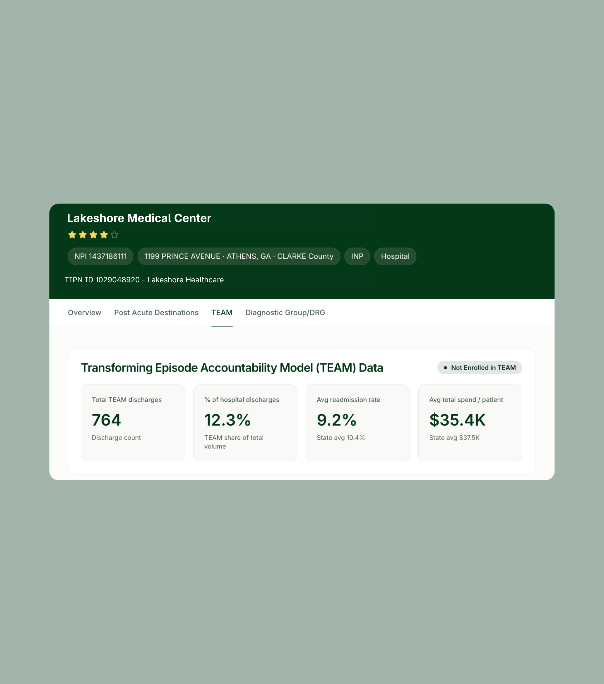
  • Confirm TEAM enrollment status and see episode volumes
  • See spend per patient across inpatient stay and 30 days post-discharge, giving visibility to what happens after they leave your hospital
  • Compare readmission and length of stay by episode category
  • View post-acute destinations and adherence, filtered by episode category
  • Access AI Trella Takeaways that name the highest-leverage episode to work on
Dashboard showing Lakeshore Medical Center TEAM data: total discharges 764, 12.3% share, 9.2% avg. readmits, and $35.4K avg. spend per patient; not enrolled in TEAM program.

Total Patient Cost

Follow the dollars across the whole episode

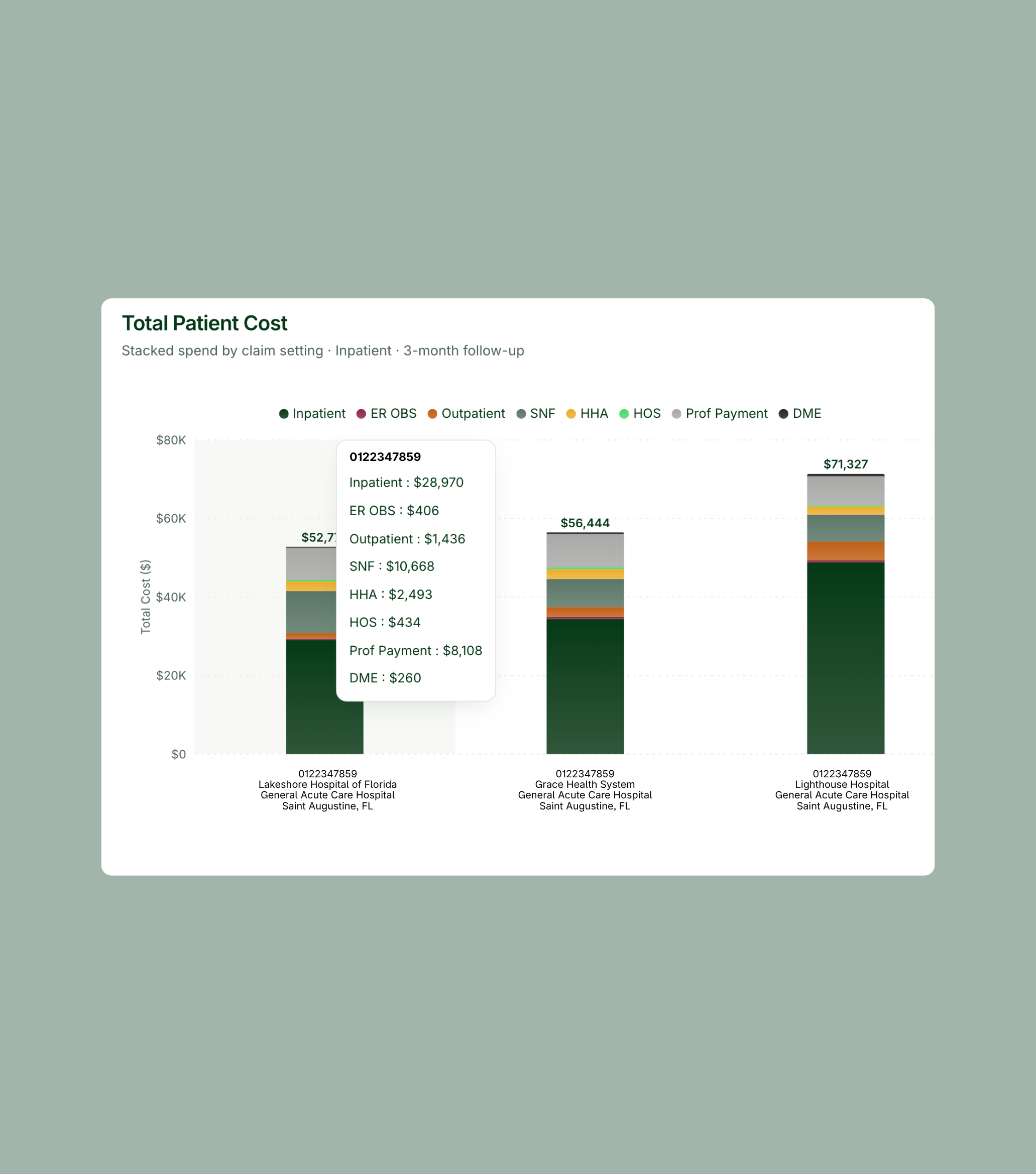
See episode-level spend across the full continuum, with your hospitals side by side. View total cost breakdowns by claim setting — inpatient, ER observation, outpatient, skilled nursing, home health, hospice, professional payment, and DME — so you can see which part of the episode is actually driving the difference between your highest- and lowest-cost facilities.
  • Gain access to all hospital NPIs to compare hospitals side by side on total episode cost
  • Break spend out by claim setting to isolate the driver
  • Leverage configurable follow-up periods and anchor settings
  • Filter by acuity and age to control for case mix
Bar chart titled “Total Patient Cost” compares stacked costs by claim setting and follow-up, with specific cost breakdowns shown in a hover box for the first bar.

The Problem

You’re accountable for outcomes you can’t see

Most systems run on partial pictures: a preferred network list built years ago, a spreadsheet of CMS star ratings, a case manager’s memory of who takes patients fast. Meanwhile referral patterns drift, volume flows to facilities nobody evaluated, and quality gaps compound quietly. Then a value-based contract or mandatory bundle puts real dollars on the line, and the questions get sharper than the data can answer.

You can't see where patients go.

Discharge orders tell you where a patient was sent. They don’t tell you where the patient was actually admitted, whether they adhered to the plan, or what happened in the 30, 60, and 90 days after.

You can't tell good partners from familiar ones.

Referral volume tends to follow relationships and habit rather than performance. Without facility-level readmission, rehospitalization, and length-of-stay data, “preferred” is a label, not a conclusion.

You can't model a change before you make one.

Redesigning a post-acute network is a high-stakes decision made largely on instinct. There’s rarely a way to test what shifting volume would actually do to readmissions, length of stay, or cost.

Who We Help

Built for the people accountable for the episode

Executive Leadership

Make strategic decisions with visibility into markets, networks, referral patterns, Medicare Advantage trends, quality performance, and total cost of care.

Learn More
Older woman with gray hair and glasses, wearing a beige blazer and blue shirt, holding and looking at a smartphone against a light background.
Operational Leaders

Improve visibility into referral activity, intake performance, patient flow, and operational efficiency across post-acute care workflows.

Learn More
Older man with gray hair wearing a dark coat, white shirt, and tie, looking to the side against a plain light background.
Clinical Leaders

Benchmark quality, evaluate outcomes, and use performance data to guide clinical strategy, referral conversations, and care delivery improvement.

Learn More
Person in navy blue scrubs stands against a light background, smiling broadly with eyes closed and arms crossed.

Frequently Asked Questions about Trella Network Insights

How is Network Insights different from the CMS star ratings we already use?

Star ratings tell you how a facility performs in general. Network Insights tells you how it performs with your patients — facility-specific rehospitalization rates, readmissions, and length of stay for the volume you actually send there, benchmarked against your county and state. It also shows you the destinations receiving your patients that aren’t on anyone’s list.

What is the Trella Score?

A 0–100 quality rating for each post-acute partner, combining facility-specific hospitalization rate, facility-specific risk score, 30-day readmission rate, and inpatient length of stay. The weighting is configurable — you can rebalance the components to match how your organization defines quality, and optionally add a custom engagement metric. All scores recalculate immediately.

Do we have to change our network to get value from this?

No. Most organizations start with the Hospital Scorecard simply to see what’s happening today — channel distribution, adherence gaps, readmission trends by setting and DRG. Network Modeler is there when you’re ready to act.

Can we model without committing to anything?

Yes. Scenarios are saved models, not published changes. Build several, compare them, export the one that holds up, and take it to your network committee.

Does this help with TEAM?

Yes. Network Insights includes a dedicated TEAM view covering enrollment status, episode volumes, readmission and spend per patient against state benchmarks, category-level performance across all five episode categories, and the post-acute destinations those episodes route to.

How do we get started?

To learn more about Network Insights or to request a demo, fill out a form here and our team will be in touch within one business day.

Where AI-enabled intelligence becomes decisive action.

From market intelligence and CRM to care transition automation, Trella connects intelligence and workflows to improve business and clinical outcomes.